This past Thursday was the start of the Farnham Malthings Unraveled Virtual Festival. I kicked it off with a class by Felicity Ford called “Sunsets & Sheep: Recolouring a Stranded Colourwork Design – Felicity Ford” which said it would build “confidence around changing the colours of a stranded colourwork design. We’ll use the Shetland Muse hat as our case study. We will analyse the colours and shading used in this design and use some basic colour theory to explore alternative palettes.”
The Shetland Muse Hat is part of the Shetland Wool Week 2019 Annual, which I bought when I attended Wool Week. And it was immediately one of the patterns I wanted to make. It’s a gorgeous hat with a fun, but also elegant and complex design. I’m normally somebody who doesn’t shy away from altering a pattern, and I rarely use the yarn a pattern calls for, much less the same colors. I also consider myself to be somebody with a decent background in color theory. But this hat intimidated me – I could see there was a LOT going on in there with the colors, and I couldn’t bear the thought of picking out a different color palette only to have it spoil the design. So I resigned myself to someday buying the colors it called for.
Thus, when I saw the promotion for this class (and that it actually took place in a virtual event on the same side of the Atlantic as me) it took me all of a few minutes to sign up and tell my boss I was taking the day off. It didn’t hurt that I’d taken a class with Felicity during Shetland Wool Week, and had found her to be a great instructor who taught an informative class.
I was not disappointed. She completely deconstructed the pattern in terms of light vs dark, warm vs cool (and why the warm colors are the light colors in this design), as well as foreground vs background and why the colors in each don’t change at the same time. We had worksheets to start picking out our own colors. She suggested we start with the mid-tone in the cool colors as it’s the one closest to our face, so I chose a teal-blue color as one that looks particularly good on me.
The other bit I found really interesting was that her sample color wheel was based on the light spectrum primaries (red/green/blue) instead of pigment (red/yellow/blue) which changes what is opposite on the wheel. As Felicity was very sure to point out, the color wheel doesn’t provide fixed rules. But for me, I found it really helpful to break away from the complementary color rules I’d learned year after year in school. Being faced with a different color wheel actually helped me avoid the pitfall of “rules”.
While the worksheets were provided as PDFs to print off, I’d also taken a screenshot to use in Paint (very sophisticated, I know!) to play with my colors and then worked to replicate them with my water color pencils. My first try combined the teal with hot pinks, but next to the teal they seemed cooler than I wanted. I just wasn’t satisfied with the result.
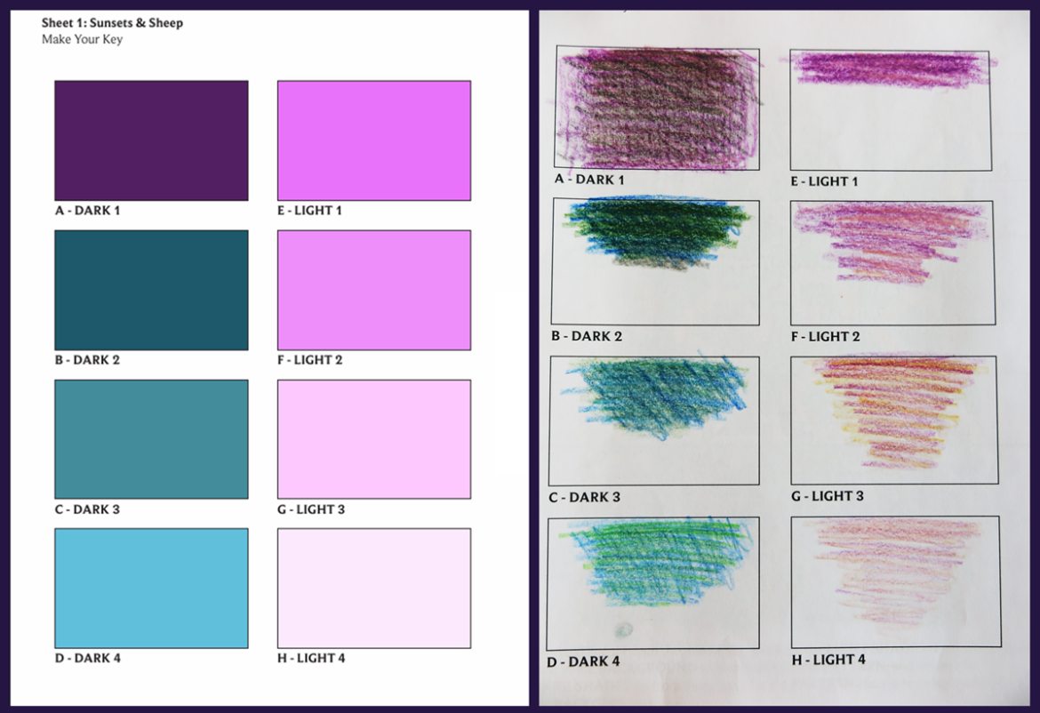
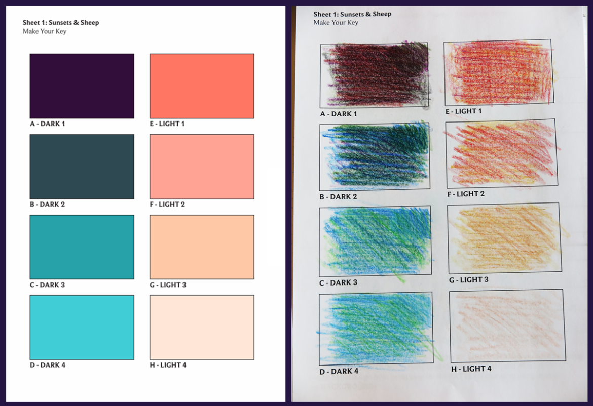
So I gave it another go, and switched to orange as my warm color, because I love orange, and it did keep the sunset theme. I found that I wanted a greener teal when I switched to orange, though the change is subtle.
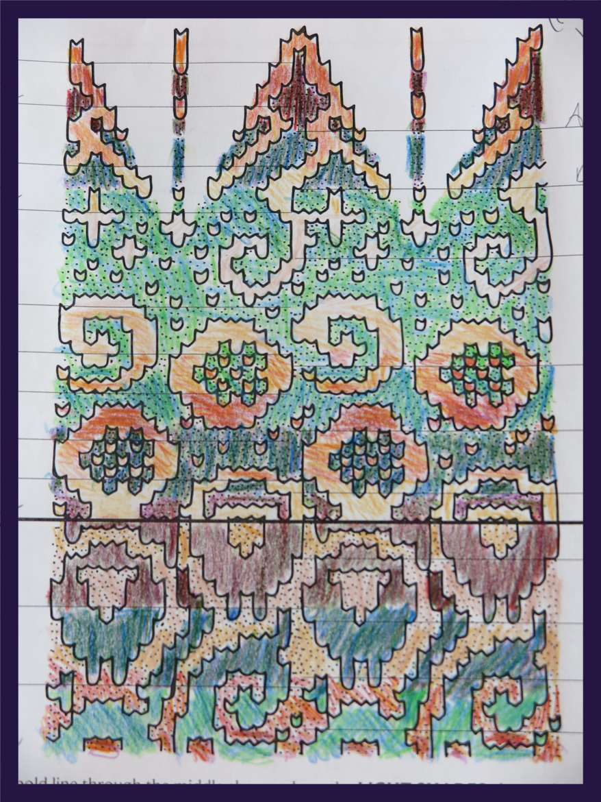
Once I was happy, I set about coloring in the design worksheet. I didn’t get far before the class wrapped up, because with my limited pencil palette (12 colors), my shades were multi-layered to get anywhere close. However, I was feeling excited enough that I did finish it the same afternoon. I think I did a really good job with the oranges, but the teals came out rather more green.
Felicity was awesome though, and shortly after the class sent me a PNG version of the worksheet so I could use the “fill” feature of paint to add my computer generated shades. When I’d tried to pull the image from the PDF, it had all these (invisible) gray tones that meant the fill feature would only get a few pixels at a time – not nice.
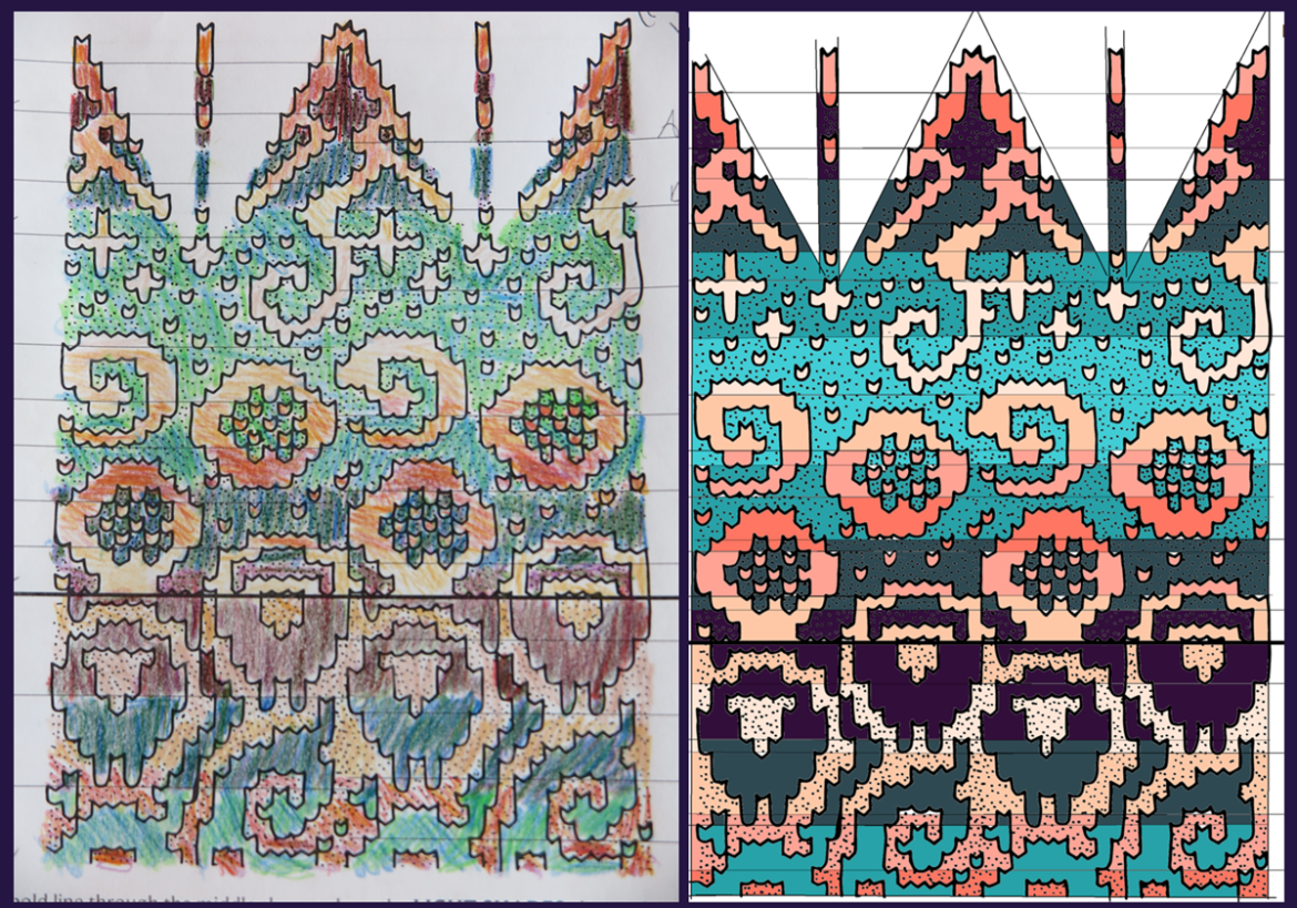
And wow am I happy with how my colors are turning out. I do think having both the computer “perfect” image alongside the pencil “imperfect” one is really helpful though, as it’s helped give me a sense of how well my palette will hold up when I go to match yarns, because I’m not going to find exactly my eight shades in precisely the same yarn.
I’m also tempted to pull out the stranded color work design I started back in 2019 because I think I may be better equipped to see where my design and my color changes weren’t quite working, and get past the roadblocks.
In short – if you get an opportunity to take this class, and you have any interested in stranded color work and color in general, jump on it! She does a great job teaching the material in the class, and breaks it down such that everybody is going to walk away with something, no matter what level they came in at.
